2016UI和色彩灵感
Nike Free Flyknit – microsite concept by Christian Vizcarra Cabrera in Brazil
This is Christian’s microsite concept for nike fit to fly, a single thread knitted constructed shoe upper that provides a second skin feel when worn. Try to say that 5 times fast. Christian states “My idea is to create a minimal website with hight impact visuals and a better experience for the users”.
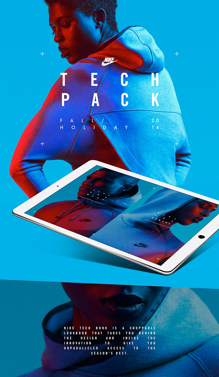
Nike Tech Pack in store app by Shakir Dzheyranov Luis Liwag in the USA
If new color use is your thing then this piece is sure to please. Nike Tech Book is described as “a shoppable lookbook that takes you behind the design and inside the innovation to give you unparalleled access to the season’s best.”
Star Wars: Force University by Fernando Baez, Pablo Chico and Carlos Pariente A. in Spain
What would happen if Jedis & Siths were able to study at University? This is the result. This is a concept project.
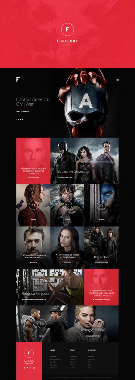
FinalCut by Loris Stavrinides in Cyprus
Loris does a great job in this concept design for an online magazine portal about the world of movie blockbusters, stars and big screen news.
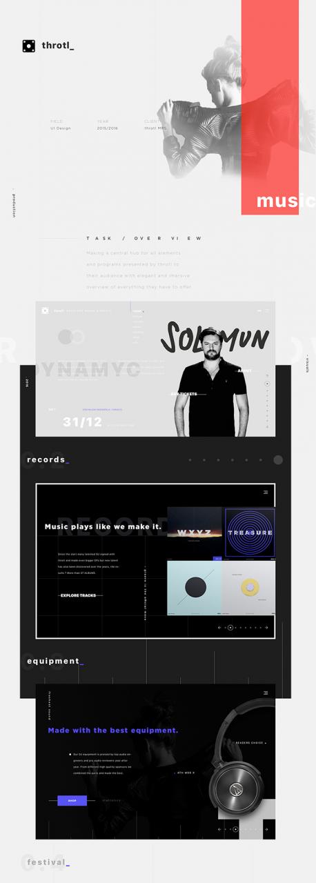
Throtl_ music festival website by Sefik Skejic in Bosnia and Herzegovina
A full website experience design for a music producing and event organizing company ( throtl_ ). Cool name, cool visuals.
SHOE GURU Shop by Pawel Skupien in Poland Jablonski Marketing in Canada
SHOE GURU Shop. No details given but it\’s pretty self-explanatory and very nicely executed.
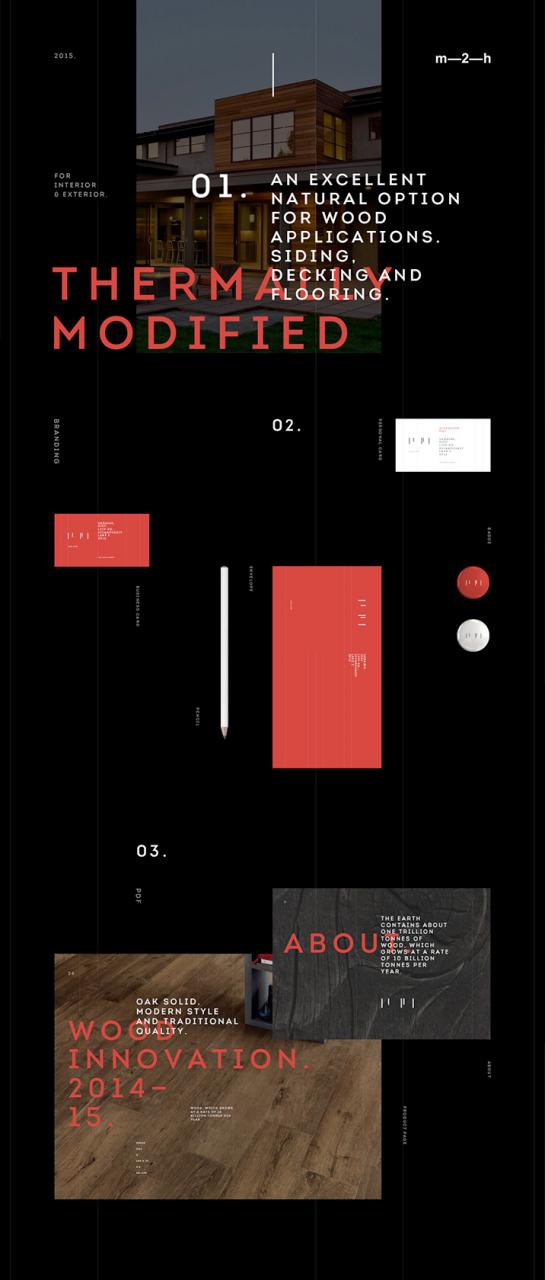
Long Life Wood by Alexander Laguta Alex Smolkin in Russia
Some very on-trend work for Long Life Wood — a manufacturer of thermally solid wood flooring, decking, cladding and other wood products.
Craigslist redesign concept 2016 by Aurelien Salomon in Canada
A visual redesign of Craigslist done for fun. If only…
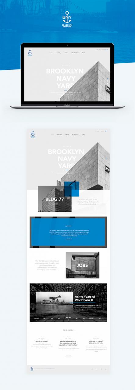
BNY by Chris Novaks Andreas S in the USA
A design pitch for Brooklyn Navy Yard that made the cut thanks to clean and contemporary design.
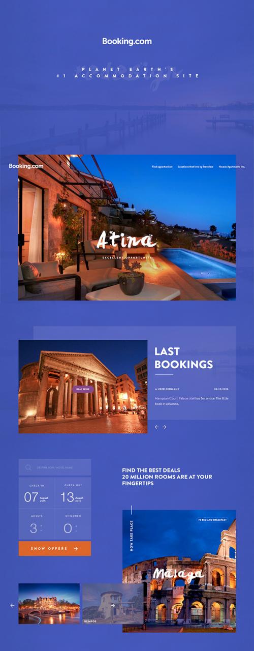
Booking.com | redesign concept by Yalcin Ozgan in Turkey
Redesign booking.com website. This is a personal project very tastefully performed by Yalcin.
Inty by Alexander Laguta Alex Smolkin in Russia
Inty is an interactive installations and presentations studio. The Inty team have created a full set of tools, guidelines, branding elements and animation based on a hero of whitespace. Excellent job.
Project tri – g by tri – g in South Korea
Tri – g offers no explanation of project 8, choosing to simply say thank you! No… thank you tri – g.






该文章评论功能已经关闭!